So I'm super into experimental and striking print/editorial/typographic design, so that's primarily what I'll be sharing.
Series of soccer player posters by Zoran Lucic.
Editorial design by Florencia Fuertes.
Sake Packaging design by Michael Nguyen.
Freak Folk Festival Campaign design by Ro Gal.
Event Promotion design by Lucila Quintana
There's just a lot of really awesome and nuanced print design coming out of Argentinian students from what I can tell from Behance.
How about we make fun of some awful design now?
Yeah, Neil, I get hit every day on Marta by your terrible ads.
"Hey man, racism is gone! Sexism, too! I don't see color! *unbearably loud fart noises*"
Seriously, racist and sexist advertising is still going on constantly. It doesn't matter how good your design is, it's automatically bad if it's bigoted *cough cough* American Apparel *cough*
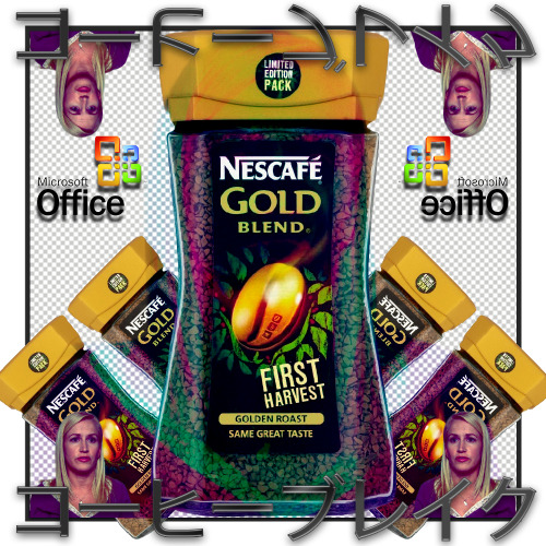
Tryhard vaporwave/net art. Love some of the originators of this stuff and thought they were taking really interesting approaches on appropriating capitalist design, but seriously some of the crap people put out with this "aesthetic" is just plain awful.
That's all for now.


No comments:
Post a Comment