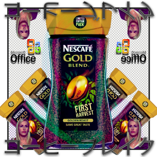
Here's a thing I did. I was thinking of calling it "Mess," but upon Stan's reaction to that, I suppose I'll be thinking of some other options. But it is a mess. So I don't know. Silly string, acrylic paint, spray paint, wire, gold foil, glitter, gold glitter glue, thread, 1 bass string, 1 CD-R, and some cayenne pepper.
9.30.2014
9.24.2014
Hashtag Trendy
So here's the thing: I'm gonna trash-talk a bunch of current trends and try to be real sarcastic here, but what can I say? A lot of trendy designs going on right now are actually really great and as long as they're done tastefully, I think there's not much harm in following trends like these. Of course they're going to get washed out and overused, but they wouldn't be trends if they weren't eventually going to anyway.
You know it, you love it: Hand-lettering.
It all gets a little tiring to me when these vomitrocious generic quotes are overlayed on some nature photo. I mean, they look great, don't get me wrong, but at a certain point you've gotta understand that literally everyone with a scanner and photoshop is doing this.
It's interesting to see modern brands sort of fight themselves due to these graphic trends. There's this big rise in the common, internet-shared design world to head towards these more DIY, hand-crafted, artisanal, home-made, warm, rustic visuals, which seems in stark contrast to most contemporary branding, forefronted by companies like Apple and Microsoft, those so integrated into our daily lives yet so completely clean and corporate when it comes to design. It's interesting to look at a brand like Lush Cosmetics and see how they moved towards a clean, corporate web presence, but still keep the hand-brushed type prevalent in their stores and physical products. It's quite clear that in an age with so much abstract communication, large companies are finding it harder and harder to appeal to what's trendy.
Here's some brush type and pastel colors, some more trends I love and yet acknowledge as starting to become overdone:
So this is the first of the diptych of trends I have noticed, the other is a completely different monster, but still have become intertwined with the DIY aesthetic:
The refined contemporary digital age and flat design.
Vector outlines, bold colors, flat shapes, strewn-about typography.
Flat waves, random shapes/symbols, subtle gradients.
Repurposing greek and antique busts/sculptures/architecture/etc.
I'll leave it at that for now, there's so much I could say about this stuff and more. I really love a lot of the design that's happening now and spreading so quickly because of the internet. There's a lot of reappropriation of the cold, corporatism of the 90s and the beginning of the internet age being critiqued through modern design. A lot of what I've seen lately has either just been really well-executed or had a powerful irony to it through design. Unfortunately, as a result of the vast conglomerate that is the internet, what may begin with real unique and genuine intent can become easily bastardized and instantly dated the second someone does it in a mediocre fashion. I've seen it happen all too often with recent trends in design, music, and fine art as well. The incessant subcatagorization of everything and plagarism of everything upon itself has at times winded me as a designer, and especially as a musician. I can only hope to keep pushing my own boundaries and working within what I think is an appropriate aesthetic for my design style and voice and just hope for the best. I think at this point we're all just taking shots in the dark. There's good and bad to all that lies ahead within a world of such open exposure and fluidity. I don't know what I'm saying anymore.
9.17.2014
30-Minute World Peace Poster
Stan asked us to, with what we had on hand, concept and design a 12 x 18 poster for world peace, International Day of Piece, or anything like that. So here's a thing I did really quick:
9.07.2014
The Good, the Rad, and the Shrugly
So I'm super into experimental and striking print/editorial/typographic design, so that's primarily what I'll be sharing.
Series of soccer player posters by Zoran Lucic.
Editorial design by Florencia Fuertes.
Sake Packaging design by Michael Nguyen.
Freak Folk Festival Campaign design by Ro Gal.
Event Promotion design by Lucila Quintana
There's just a lot of really awesome and nuanced print design coming out of Argentinian students from what I can tell from Behance.
How about we make fun of some awful design now?
Yeah, Neil, I get hit every day on Marta by your terrible ads.
"Hey man, racism is gone! Sexism, too! I don't see color! *unbearably loud fart noises*"
Seriously, racist and sexist advertising is still going on constantly. It doesn't matter how good your design is, it's automatically bad if it's bigoted *cough cough* American Apparel *cough*
Tryhard vaporwave/net art. Love some of the originators of this stuff and thought they were taking really interesting approaches on appropriating capitalist design, but seriously some of the crap people put out with this "aesthetic" is just plain awful.
That's all for now.
9.04.2014
Subscribe to:
Posts (Atom)


